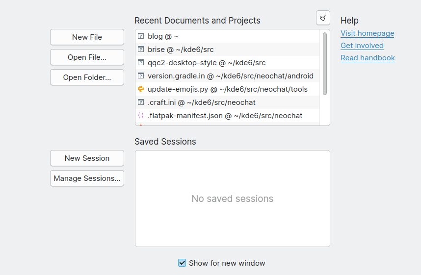
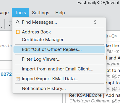
Brise theme is yet another fork of Breeze. The name comes having both the French and German translations of Breeze, being Brise.
As some people know, I’m contributing quite a lot to the Breeze style for the Plasma 6 release and I don’t intend to stop doing that. Both git repositories share the same git history and I didn’t massively rename all the C++ classes from BreezeStyle to BriseStyle to make it as easy as possible to backport commits from one repository to the other. There are also no plans to make this the new default style for Plasma.
My goal with this Qt style is to have a style that is not a big departure of Breeze like you know it but does contain some cosmetic small changes. This would serve as a place where I can experiment with new ideas and if they tend to be popular to then move them to Breeze.
Here is a breakdown of all the changes I made so far.
I made Brise coinstallable with Breeze, so that users can have both installed simultaneously. I minified the changes to avoid merge conflicts while doing so.
I increased the border radius of all the elements from 3 pixels to 5 pixels. This value is configurable between small (3 pixels), medium (5 pixels) and large (7 pixels). A merge request was opened in Breeze and might make it into Plasma 6.1. The only difference is that in breeze the default will likely keep being 3 pixels for the time being.

- Add a separator between the search field and the title in the standard KDE config windows which serves as an extension of the separator between the list of the setting’s categories and the setting’s page. This is mostly to be similar to System Settings and other Kirigami applications. There is a pending merge request for this also in Breeze.
- A new tab style that removes the blue lines from the active lines and introduce other small changes. Non-editable tabs are also now filling the entire horizontal space available. I’m not completely happy with the look yet, so no merge requests have been submitted to Breeze.

- Remove outlines from menu and combobox items. My goal is to go in the same direction as KirigamiAddons.RoundedItemDelegate.
- Ensure that all the controls have the same height. Currently a small disparency in height is noticeable when they are in the same row. The patch is still a bit hacky and needs some wider testing on a large range of apps to ensure no regressions, but it is also a improvement I will definitively submit upstream once I feel like it’s ready.
Here, in these two screenshots, every control has 35 pixels as height.
Finally here is Kate and KMail’s settings with Breeze and Brise.


Comments
With an account on the Fediverse or Mastodon, you can respond to this post. Since Mastodon is decentralized, you can use your existing account hosted by another Mastodon server or compatible platform if you don't have an account on this one. Known non-private replies are displayed below.
Learn how this is implemented here.