One design characteristic of our QtWidgets is that they contain a lot of frames and frames inside other frames. This worked well with Oxygen style and its skeuomorphism shadow, less so with Breeze.
I first thought this was inheriten with QtWidgets and couldn’t be fixed without
much effort. But fortunately, after looking a bit into Qt source codes and in
particular in the internals of QDockAreaLayout, I discovered that the engine to
draw and style the built-in components of QtWidgets: QStyle has a
QStyle::PE_IndicatorDockWidgetResizeHandle primitive which allows drawing
separators between detachable docks and similarly there is QStyle::CE_Splitter
to paint the separator between elements inside a QSplitter. This is huge
because this means instead of drawing frames, we can render separator and then
get rid of most of our frames in our apps.
This is how Qt Linguist tool looks like with this change.
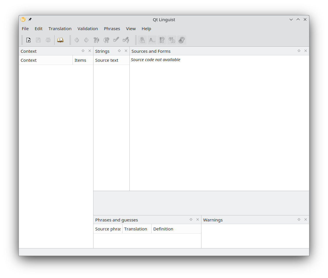
Unfortunately, there are still some places where we do want to draw frames, so we can’t remove them all. I added a heuristic that tries to determine when to draw one based on the spacing and margins of the parent layout. A heuristic is never perfect, but an app can additionally force the style to display a frame or vice versa force the style not to display it.
For more complex apps (read with more custom components), this change require a bit of tweaking but with a handful of one-liner in Kate, I got this modern look.
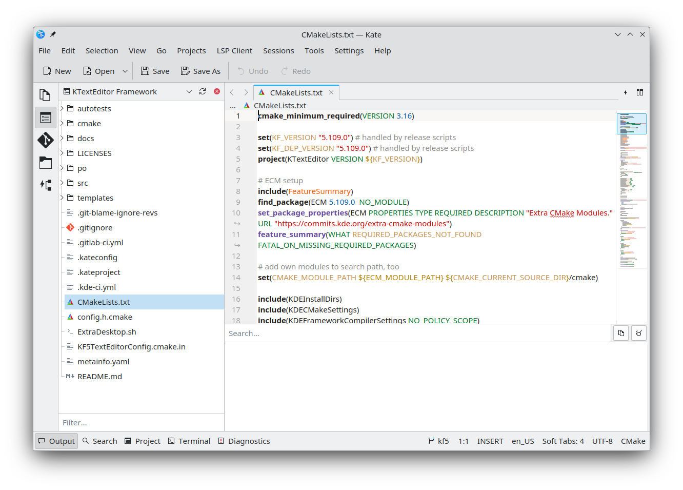
This is not perfect yet and this will require a bit more tweaking around the tab bar, but is already a big departure from the current style.
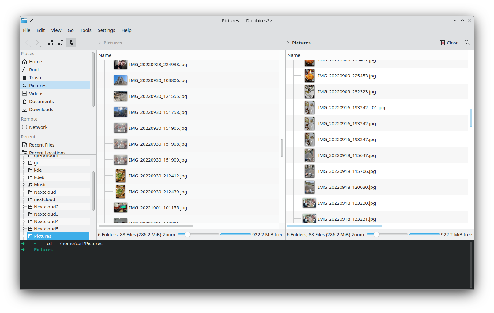
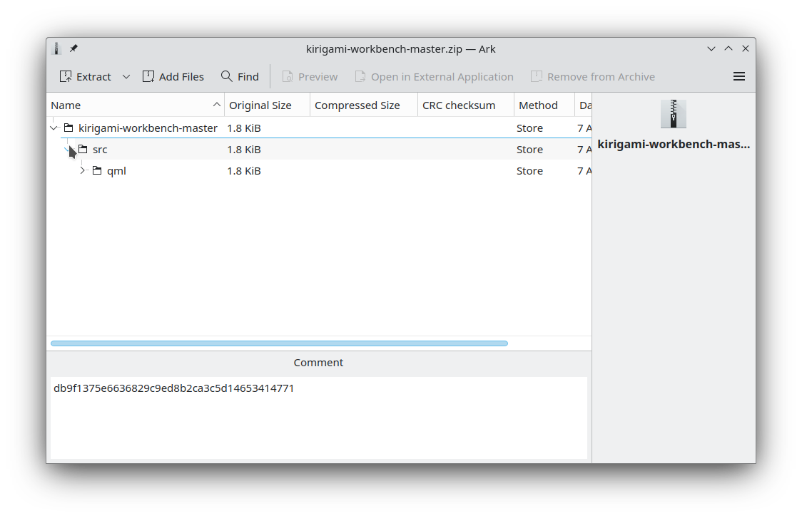
Similar, this is how Dolphin and Ark, look with these changes:
If you like this change, don’t hesitate to put a 👍 on the pending MR, and if you are a developer, please test your app with this change and look at how I adapted a few apps already. I tried the change with some big apps like Krita and Kdevelop and it looks good, but the more testing, the better it is.
Comments
With an account on the Fediverse or Mastodon, you can respond to this post. Since Mastodon is decentralized, you can use your existing account hosted by another Mastodon server or compatible platform if you don't have an account on this one. Known non-private replies are displayed below.
Learn how this is implemented here.