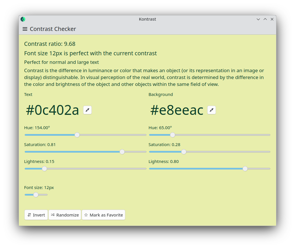
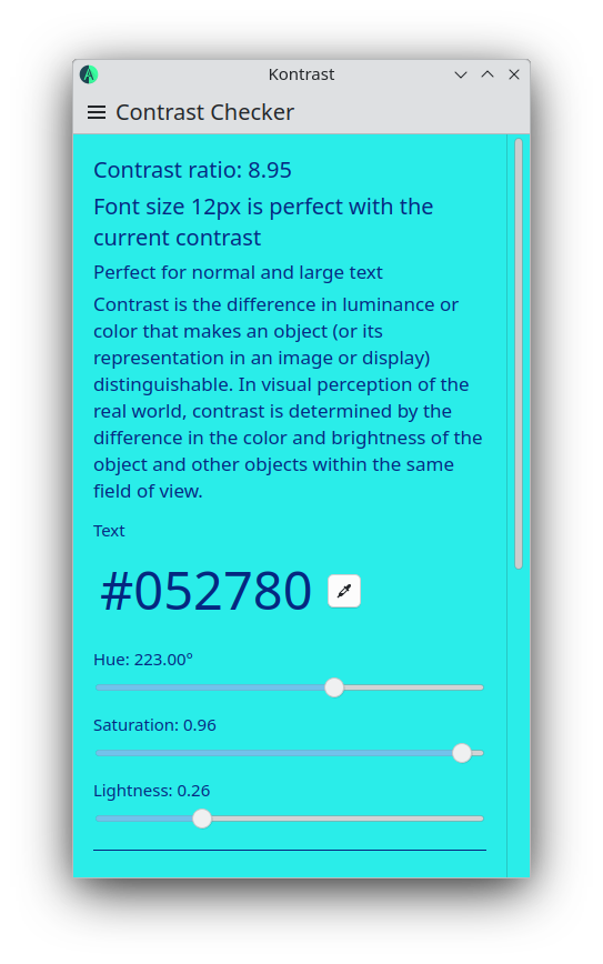
Kontrast is a contrast checker available for desktop and mobile devices. You can use Kontrast to choose background and text color combinations for your website or app that your users will find easy to read. Kontrast can help you improve the accessibility for your site or app for people with vision problems.
Kontrast won’t catch all the problems, but it should still be very helpful to catch many issues early on, when designing your interface.
I released the first version of Kontrast earlier this month.

Another big feature of Kontrast is the possibility to generate random color combinations with good contrast. These colors can be saved in the application itself, so that you can keep a particularly good color combination for later use.
Kontrast is available for the Linux desktop, Plasma Mobile and there is also a Beta version for Android.
This application is built using the excellent Kirigami framework.

You can download and install Kontrast from Flathub and a nightly build is also available in binary factory.
The tarball is available here and is signed with my gpg key 14B0ED91B5783415D0AA1E0A06B35D38387B67BE.
Future Improvements
Future plans include improving the Android build, possibly release a stable build of the Android version and also create a QtQuick-based color picker that is better integrated with the application.