Kirigami Addons 0.11.0 is out! This release bring a bunch of new components as well as improving existings one. Since I forgot to write an announcement for the 0.10, I will mention some of the new features of 0.10 too.
Banner (0.10.0)
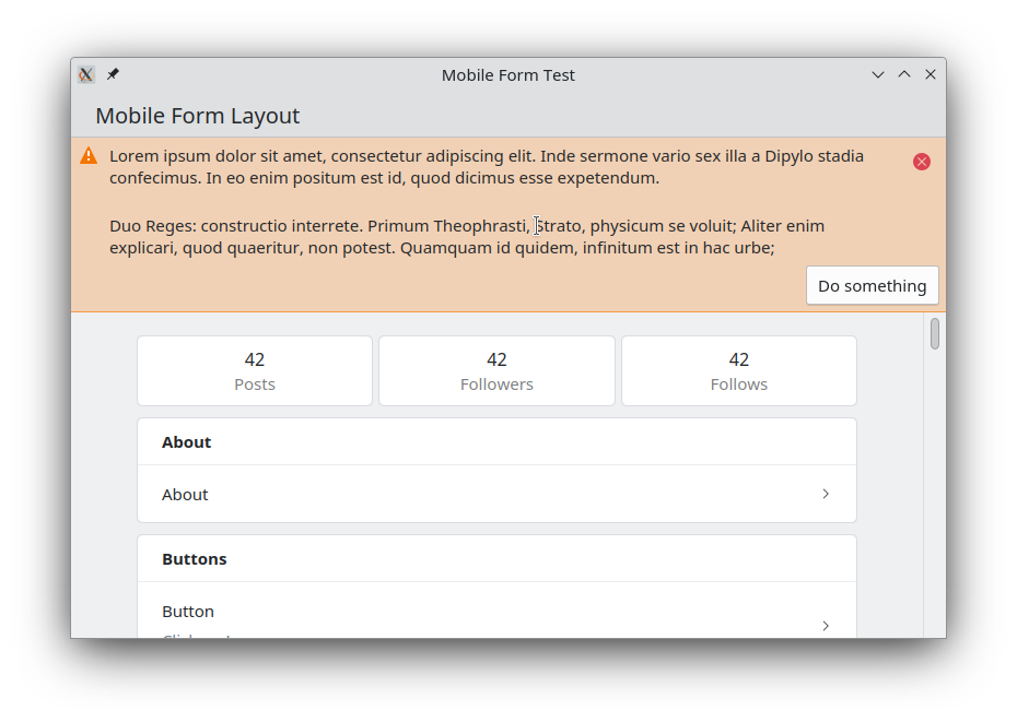
This helpful component is similar to Kirigami.InlineMessage and can be used
as the footer or header of a page.
Delegates (0.10.0)
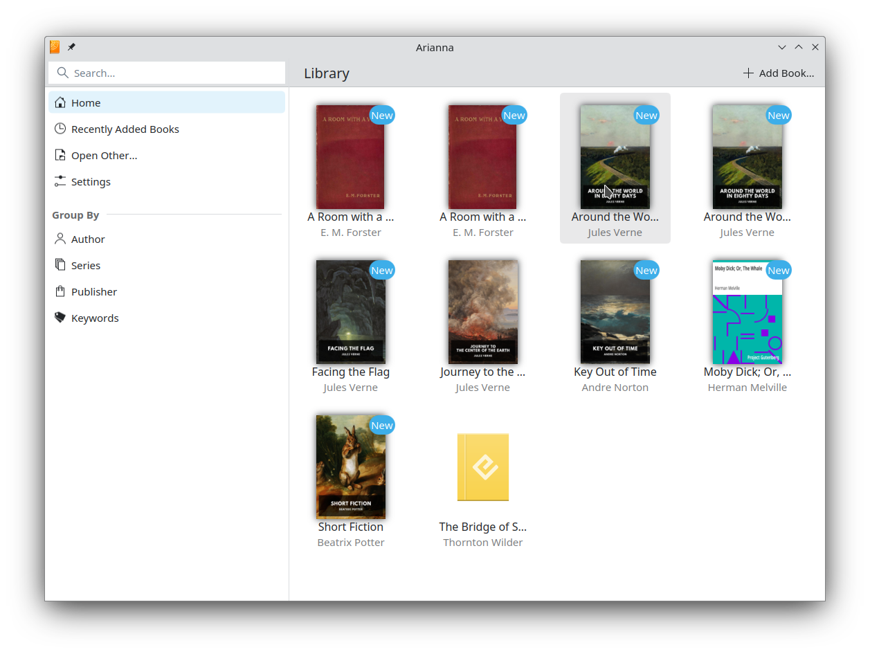
Kirigami Addons 0.10.0 bring two new list and grid delegates:
RoundedItemDelegate:This delegate provides a nice rounded background for items inside a list or grid. Here you can see it in action in Arianna where it is used both in the grid and the sidebar.
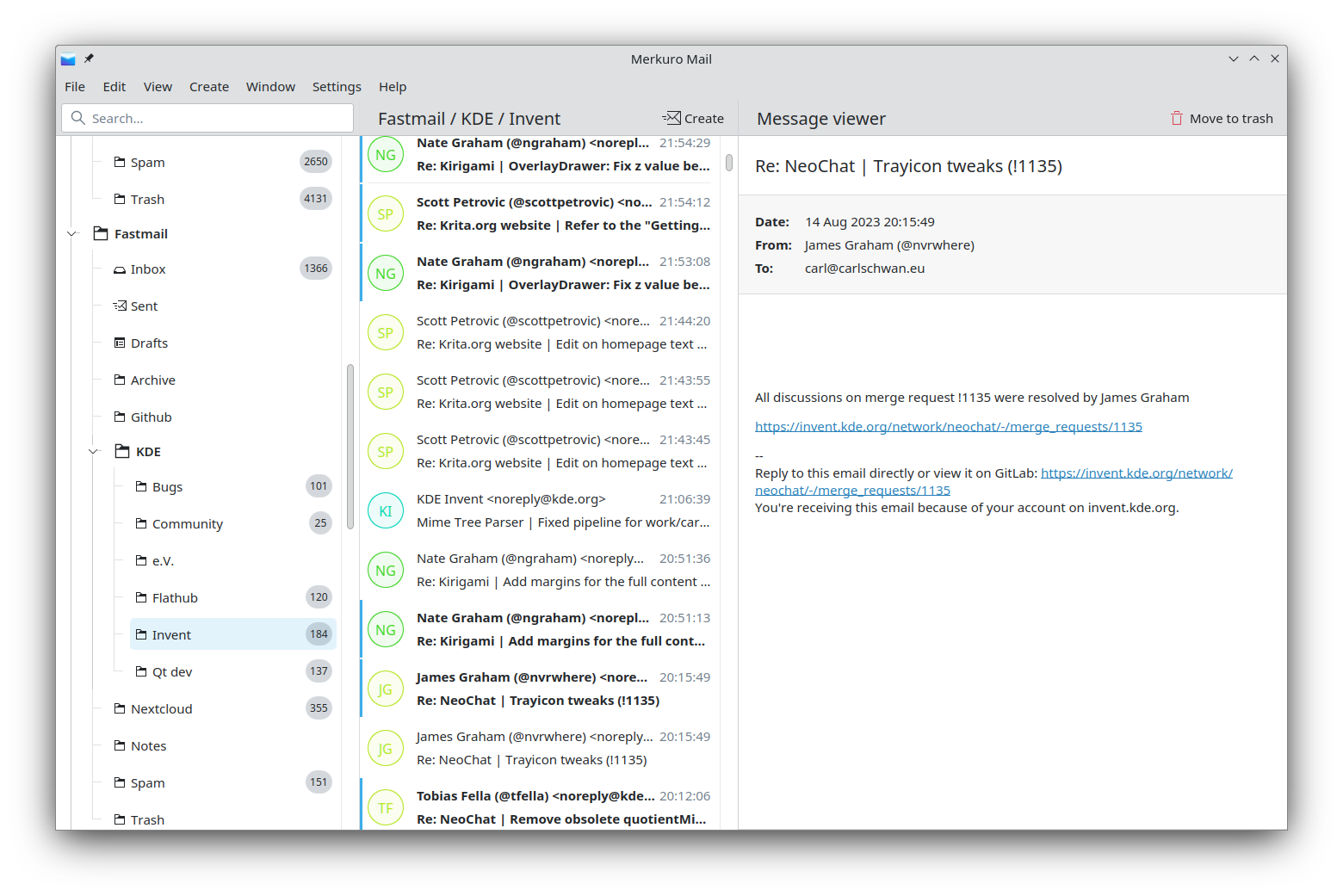
IndicatorItemDelegate: This component is the perfect list delegate for an inbox where elements can be either marked as read or unread (e.g in an email client).
Avatar (0.10.0)
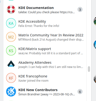
We moved Kirigami.Avatar from Kirigami to Kirigami Addons. We tweaked a bit the
API at the same time, and Avatar is no longer based on the AbstractButton component
but is just an Item which can be used for decorative purpose.
In 0.11.0, we additionally introduced AvatarButton which can be used if you need to have an interactable element.
We also updated the look of the placeholder, when no avatar images is found, to be a bit less visually heavy and use a pale color. Fun fact, this is a design I also introduced in Nextcloud a year ago.
MobileForm.FormHeader (0.10.0)
FormCardHeader is now deprecated and we are replacing it with FormHeader.
The difference is that FormHeader is placed outside of the cards.
Kirigami Settings (0.11.0)
We moved Kirigami.CategorizedSettings and Kirigami.SettingAction from
Kirigami to Kirigami Addons. We used this opportunity to do a visual refresh of
the component.
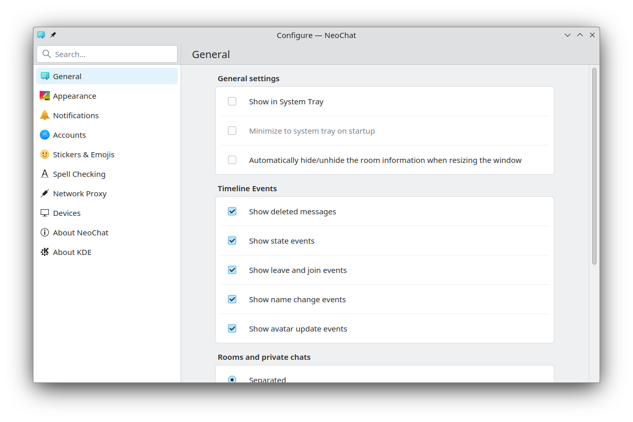
Currently the search feature only search inside the title of the categories but in the future, we would like it to also search inside the content the pages.
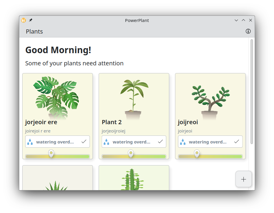
Floating buttons (0.11.0)
In KF6, for Kirigami we are removing the automatic floating buttons. As a replacement
we are adding two new components: FloatingButton and DoubleFloatingButton. These
components were extracted from Powerplant,
Audiotube and Marknote.
This is how this looks in Powerplant.
MobileForm is now FormCard (0.11.0)
We decided to rename MobileForm to FormCard since this new layout is also used on other form factors. As part of the renaming we used the opportunity to do some small but welcome change to the api. A lot of boilerplate for the layout is not needed anymore.
diff --git a/src/qml/RoomSettings/Permissions.qml b/src/qml/RoomSettings/Permissions.qml
index 07b8a942..674ee4a5 100644
--- a/src/qml/RoomSettings/Permissions.qml
+++ b/src/qml/RoomSettings/Permissions.qml
-import org.kde.kirigamiaddons.labs.mobileform 0.1 as MobileForm
+import org.kde.kirigamiaddons.formcard 1.0 as FormCard

-Kirigami.ScrollablePage {
+FormCard.FormCardPage {
-    id: root
-
-    title: i18nc("@title:window", "Notifications")
-    topPadding: 0
-    leftPadding: 0
-    rightPadding: 0
-    ColumnLayout {
-        spacing: 0
-        MobileForm.FormCard {
-            contentItem: ColumnLayout {
-                spacing: 0
-
-                MobileForm.FormCardHeader {
-                    Layout.fillWidth: true
-                    title: i18n("Room notifications setting")
-                }
-
-                MobileForm.FormRadioDelegate {
-                    text: i18n("Follow global setting")
-                    onToggled: { ... }
-                }
-            }
-        }
-    }
+
+    FormCard.FormHeader {
+        title: i18n("Room notifications setting")
+    }
+
+    FormCard.FormCard {
+        FormCard.FormRadioDelegate {
+            text: i18n("Follow global setting")
+            onToggled: { ... }
+        }
+    }
The qml import org.kde.kirigamiaddons.labs.mobileform is still here and will
remain for the foreseeable future, but please update to the new import name to
get all the new improvements.
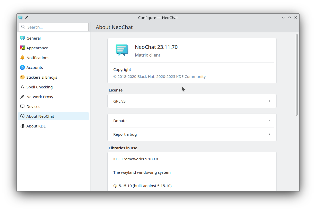
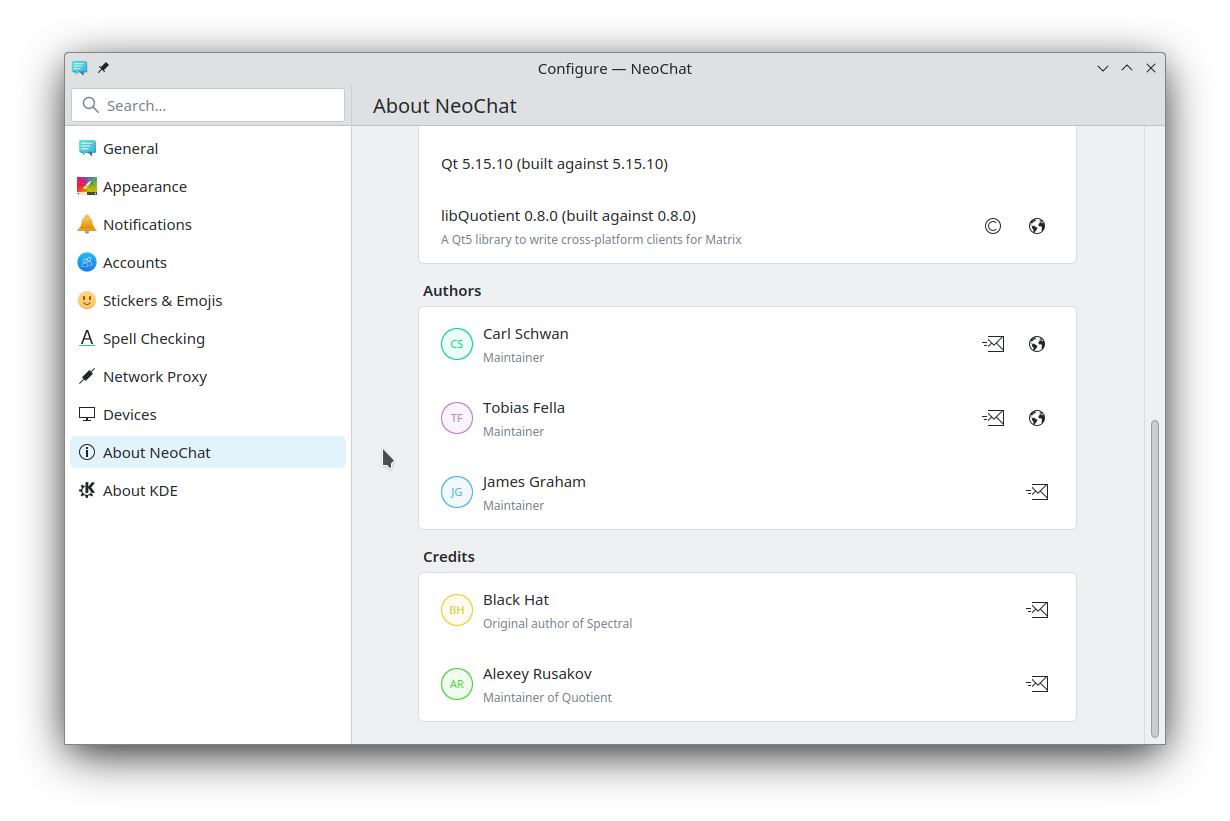
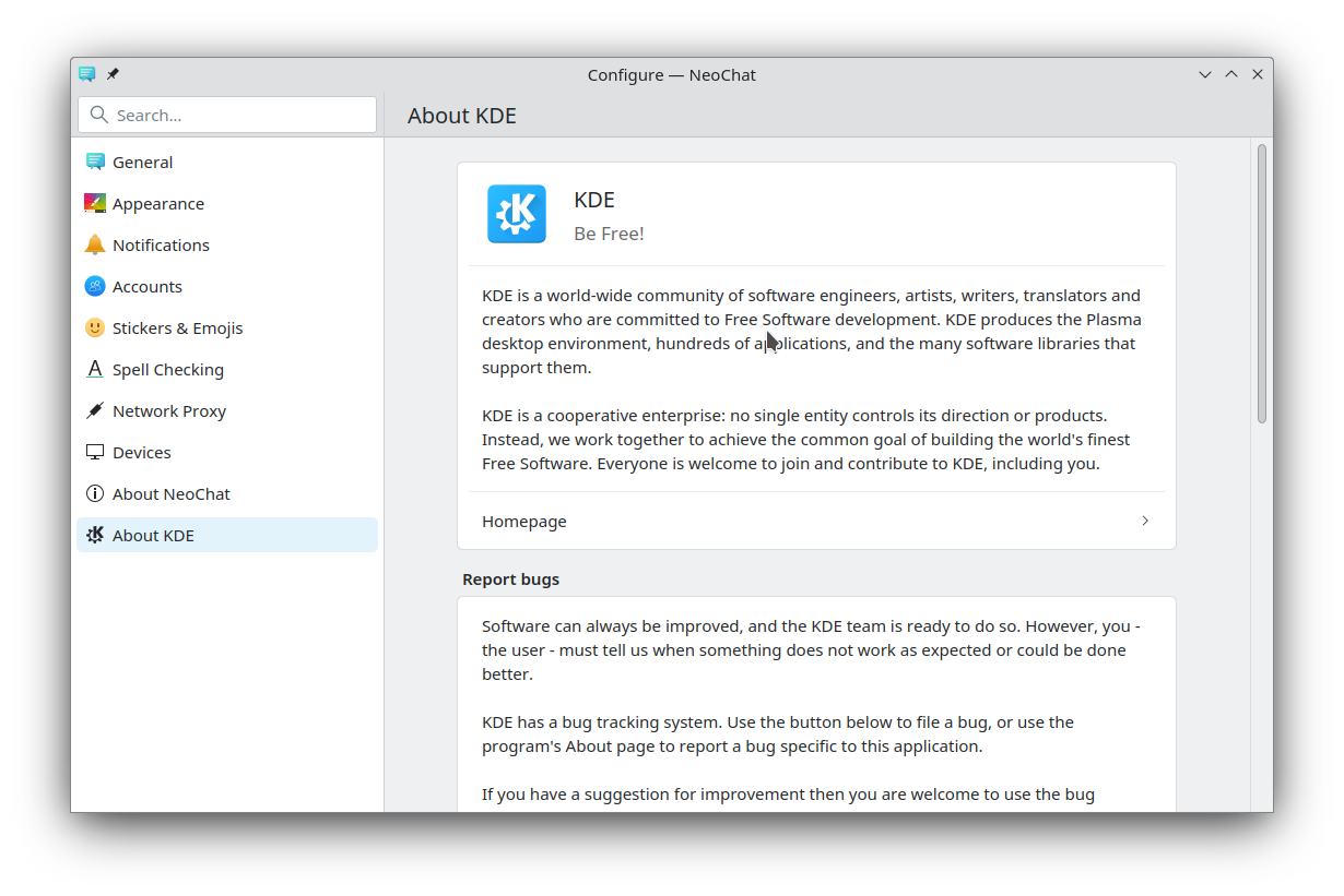
New About Pages
The look of the about page and the about kde page was also updated, to use the new Avatar and FormCard components.
Bug fixes and minor improvements
- We fixed various issues with the translations not loading for some components and added some ci checks to ensure that this doesn’t happen in the future.
- In AlbumMaximizeComponent, we are now using icon name compatible with more xdg-icon-themes
- The AboutPage now displays more information which were previously not displayed due to some broken checks.
